1. In what way does your media product use, develop or challenge forms and conventions of real media products?
I have ensured that my media product has included as many conventions from a real media product as I have listed. Due to previous research of the magazine industry, I have given my magazine the conventions of magazines that are frequent with every issue. However, I have also addressed conventions that may only be familiar in singular issues or differentiate from other magazine issues. For example, in one of my presentations, I have shown the conventions of the music magazine 'Q'. Q had included many typical music magazine conventions but also has it's perks of showing originality.

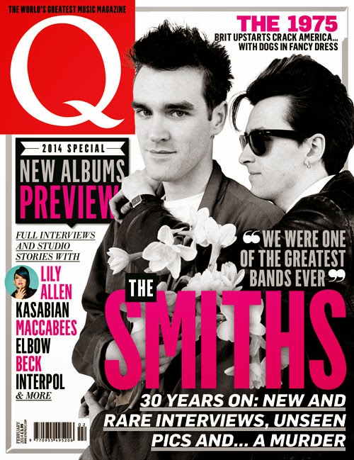
For my magazine, I wanted to incorporate originality by using Q as a style model. From the magazines I have analysed, my magazine was going to be based with certain aspects that have made the magazine stand out more than others. To do this, I had included the idea of giving the magazine a music feel. Usually, most music magazines are only told by the artist. If a well known artist is used as the cover image, the reader will assume it is a music magazine. For my magazine, I had decided to show this in a different way. Instead of having a well known artist, I have used an artist that is non-existent and upcoming as stated in the double page spread. I have shown that it is a music magazine by making the actual conventions include an understanding of how it is a music magazine. The title 'CRUSHED' has been shown with an image of a guitar that has been put in the title.

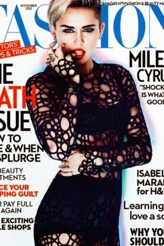
For the main image on the front cover I have based it on a fashion magazine but have decided to use the pose for my magazine for the rock/ pop vibe I want to give off from the model.

From this I have taken the pose and decided to recreate it. In this image the model is looking directly into the camera which creates an effect of them looking right at the reader and wanting them to buy it. This is relatable to every other magazine because each one has its own way of attracting its audience.

For the colour scheme I have used the red, black and white to show the rock genre. Because if this, I have based the costume on the colour scheme to help the model stand out from the page. I have used the black shirt and the red lipstick to shadow the red on the background.
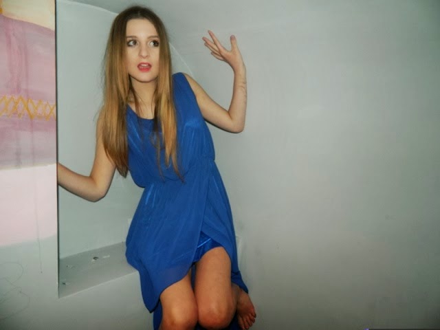
For my contents page, I wanted to carry on the theme by keeping the colour scheme and genre of rock/ pop. I did not have an image to recreate because this was an image taken originally. For the image I used a blue dress that would separate the model from the colour scheme. The model is not facing the camera this time because it is not on the cover. However, her eyes are directed towards the contents, suggesting that it is worth reading.
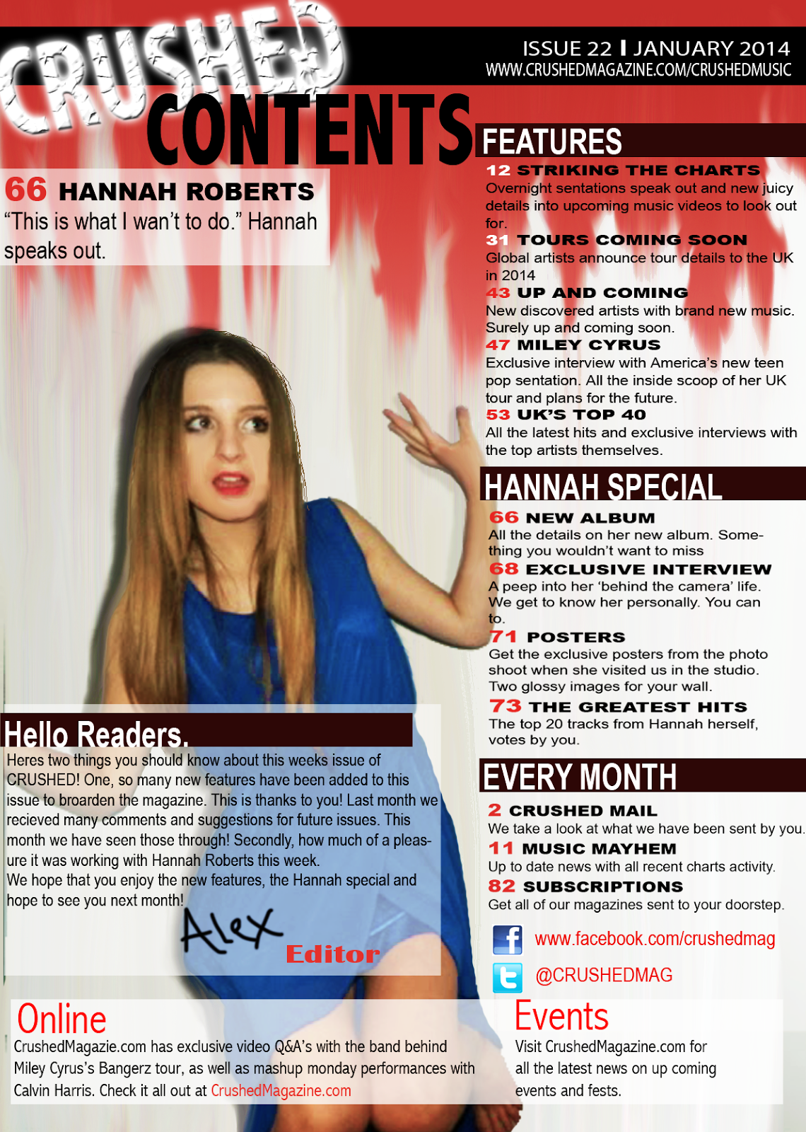
I used the image in my contents page with red running down. This contrasts the colour scheme and for the main image to stand out. It also suggests the genre of rock/ pop by making it look edgy.
With my double page spread I also used an original image and edited it to fit the genre and theme of the page. I did this by taking other shots of the dress used and cropping them and blending them to create the effect of the dress floating across the page.
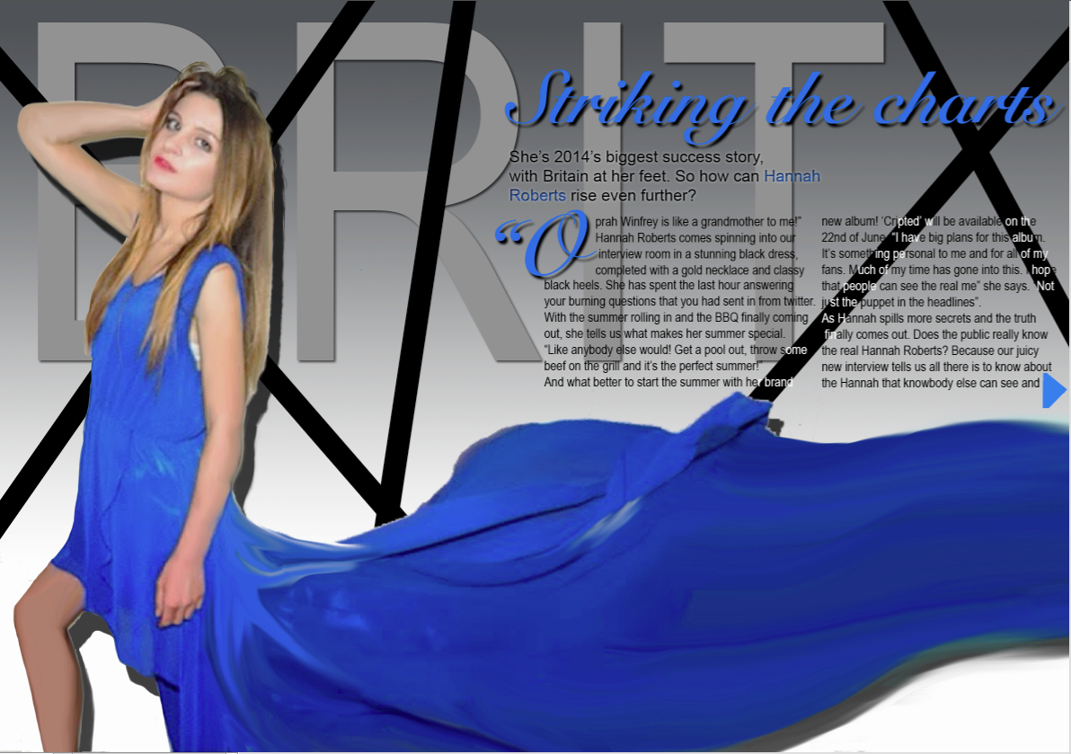
I first composed my double page spread with a grey theme. I did this to create a different background for the model.
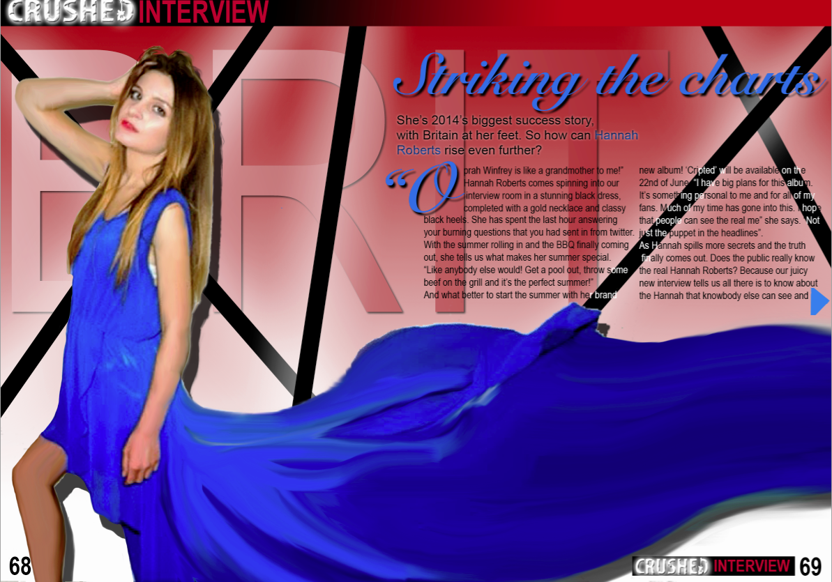
However I them realised that it wasn't constant with my colour scheme of black, red and white. I then changed the colour scheme to show that it is apart of the magazine.







 With the contents page and the double page spread, the theme has been kept consistent. The colours relate back to the main cover image. The style of the double page spread is meant to relate to the audience by capturing a teenage mind in the industry. The contents page is used to give the reader an insight of what is included in the magazine which could relate to the reader and interest the teenage and young adult audience.