Friday, 9 May 2014
Question 7
7. Looking back at your preliminary task, what do you feel you have learnt in the progression from it to the full product?
 From the start of creating my music magazine, my knowledge of using photoshop has increased considerably. For example I now know how to use different features and filters that I hadn't known was there before. In addition, I have increased my knowledge on how to blur the image into the background to make it look part of the background, making the line of the image not looking as sharp. An example of this would be my magazine contents page. For this I had to blur the image outwards to make a background for the image. This made the line of the cut out image look less sharp.
I feel like I have used more of a variety of techniques than my preliminary task. For example I have included quotes from inside the magazine, competitions and freebies (two free posters) to appeal to the audience where as my preliminary task lacked this. The images taken from the preliminary task I feel didn't give as strong as impact as the main task. This is due to the image quality. Sending the images over, it seemed to distort the image and make it look more pixelised. For my main task I fixed this by using the blur tool to smoothen the image.
Overall, my understanding of softwares has improved greatly throughout this project because at the start i'd barely used software such as photoshop in the years. Also I feel I have a greater understanding and knowledge on how to produce a music magazine and what sort of work goes into making one.
Thursday, 8 May 2014
Question 6
6. What have you learnt about technologies from the process of
constructing this product?
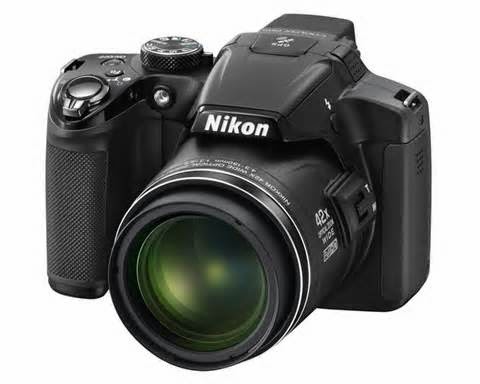
With the construction of my product, I have used many technologies to produce it. The first of all would be a Nikon camera. This was used to construct a photo shoot for images to use on my product. From the images, I used an app to create a filter that could benefit the photo to make is darker and more glossy.

After the filter was used on my images, I picked out the best ones that would attract the target audience. With the chosen image I then used photoshop. From this I had also added extra filters to suit the genre by adding a dark undertone for the rock vibe the image needed to give off. A vibrance effect was also used to enhance the colours of the clothing but keeping the dark under layer. This made the image appear bright but standing out from the page that was a vibrant red.

I then continued to use the magic wand tool that cut the image out automatically. Due to the sharp edges I then used the pencil tool to draw on the edges to blend them into the background. From this, the image has began to show pixelation. To fix this, I used the blur tool to blend out the skin to make is look smoother. From this, the image deformed where I had to use the paint tool to draw on other parts to reclaim the image.
This was also used with the contents main image and the double page spread. This is due to the same filters used to match the rest of the magazine product. The text was used by photoshop as well as it was only a simple text that I needed. The masthead of the magazine was also used in photoshop where I had used the pencil tool and a filter to create a glow, patterned effect and the cracks in the image.
constructing this product?

With the construction of my product, I have used many technologies to produce it. The first of all would be a Nikon camera. This was used to construct a photo shoot for images to use on my product. From the images, I used an app to create a filter that could benefit the photo to make is darker and more glossy.

After the filter was used on my images, I picked out the best ones that would attract the target audience. With the chosen image I then used photoshop. From this I had also added extra filters to suit the genre by adding a dark undertone for the rock vibe the image needed to give off. A vibrance effect was also used to enhance the colours of the clothing but keeping the dark under layer. This made the image appear bright but standing out from the page that was a vibrant red.

I then continued to use the magic wand tool that cut the image out automatically. Due to the sharp edges I then used the pencil tool to draw on the edges to blend them into the background. From this, the image has began to show pixelation. To fix this, I used the blur tool to blend out the skin to make is look smoother. From this, the image deformed where I had to use the paint tool to draw on other parts to reclaim the image.
This was also used with the contents main image and the double page spread. This is due to the same filters used to match the rest of the magazine product. The text was used by photoshop as well as it was only a simple text that I needed. The masthead of the magazine was also used in photoshop where I had used the pencil tool and a filter to create a glow, patterned effect and the cracks in the image.
Question 5
5. How did you attract/address your audience?
With my media product, I have addressed the target audience of teenagers and young adults by using certain conventions and imagery to appeal to them. For example, on the cover of my magazine I have used conventions that attract to the target audience. The first would be the main image. The image itself is an image of a teenager that is suggested to be a big star. I used this to attract to the target audience because it is relatable and someone to look up to. A big star would also be of someone that they follow.
Another conventions would be the context on the page. The subheadings contain other music related people that could attract younger people form their image or name. They appeal to the target audience in their own way which would benefit on the front of a teenage music genre magazine.
Thirdly, another would be the colour scheme used. This is relatable to the target audience of teenagers and young adults because of the boldness of the colours. My colour theme is red, white and black which are a trend of colours that are bold ad outgoing- relatable to the target audience as it is attracting the people with the trends and boldness of music- teenagers and young adults.
Overall, my magazine attracted it's audience by the context and the presentational conventions that would attract them. This if from imagery, colour and context.
Question 4
4. Who would be the audience for your media product?
The audience for my magazine would be teenagers and some young adults. I have done this by showing conventions on my media product that could appeal to the target audience. For example, on my media product I have included subheadings that have people such as Miley Cyrus, Coldplay and Paramore on the cover. This makes it clear to the target audience that it is for them as it includes people that they would want to read about.
It relates to them because of the way the magazine has been approached. The media product has an urban/ mature viewing by using the colours red, black and white. These are all harsh colours that stand out but could be the colours that teenagers and young adults could relate to.
The imagery used could also be seen as relating to teenagers because the main image is a teenager. The main image also shows the way a teenager could be represented by the clothing and the make-up.
Finally, the music genre itself can also relate to teenagers. With it being a pop and rock music genre, the top 40 is displayed on the front because it is mostly what teens and young adults listen to.
Wednesday, 7 May 2014
Question 3
3. What kind of media institution might distribute your media product and why?
My media product may be distributed by a media institution because of the conventions used that may relate to their selected theme. My media product would mainly attract a teenage audience so it may be best using a media institution that relates themselves to teenagers or young adults. This would be an advantage to the media product as it will be attracting the correct audience.
If the magazine product had been taken on by a media institution that didn't attract the audience then the magazine product may not get the audience it needs. My magazine may be distributed by a music media institution because if it's contents and view of the magazine. For example, my magazine cover has the image of a teenager that relates to the target audience that the media institution may be looking for. It also has music references such as the headings that include big names in the music industry that may attract the audience. To tell of it's music genre also, I have used a guitar in the title to show that it is of a music genre.
The contents is relatable to the target audience as well because of it's contents listed for the magazine. Each one represents a teenager and could attract them into the actual contents of it's pages.
Question 2
2. How does your media product represent particular social groups?


With my magazine, I have chosen the target audience of teenagers and young adults. I have used conventions on my magazine to represent the target audience. I have done this with the cover of the magazine by giving it headlines with artists that could appeal to them. For example, I have used people like Miley Cyrus, Demi Lovato and Paramore to capture the target audience.

With the conventions used, I have given my magazine a colour scheme of red, white and black. These are all bright and noticeable colours that could attract teenagers and young adults.
The main image I have chosen is suitable for the target audience because it shows direct address. The model has been picked to represent teenagers by clothing, make-up and the posing. The clothing on the model is something a teenager could relate to. She is also young which could attract the target audience as it is relatable. The make-up is darkened to suit the music theme of rock and pop, which are usually the type of music teenagers and young adults would go for.
 With the contents page and the double page spread, the theme has been kept consistent. The colours relate back to the main cover image. The style of the double page spread is meant to relate to the audience by capturing a teenage mind in the industry. The contents page is used to give the reader an insight of what is included in the magazine which could relate to the reader and interest the teenage and young adult audience.
 This is also used by the image. The image is of the person looking towards the contents suggesting that is readable by the age group and that even someone that age likes it. The red running down the page is edgy and used to attract the target audience by this.
Question 1
1. In what way does your media product use, develop or challenge forms and conventions of real media products?
I have ensured that my media product has included as many conventions from a real media product as I have listed. Due to previous research of the magazine industry, I have given my magazine the conventions of magazines that are frequent with every issue. However, I have also addressed conventions that may only be familiar in singular issues or differentiate from other magazine issues. For example, in one of my presentations, I have shown the conventions of the music magazine 'Q'. Q had included many typical music magazine conventions but also has it's perks of showing originality.
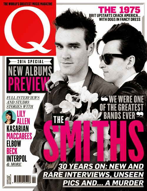
For my magazine, I wanted to incorporate originality by using Q as a style model. From the magazines I have analysed, my magazine was going to be based with certain aspects that have made the magazine stand out more than others. To do this, I had included the idea of giving the magazine a music feel. Usually, most music magazines are only told by the artist. If a well known artist is used as the cover image, the reader will assume it is a music magazine. For my magazine, I had decided to show this in a different way. Instead of having a well known artist, I have used an artist that is non-existent and upcoming as stated in the double page spread. I have shown that it is a music magazine by making the actual conventions include an understanding of how it is a music magazine. The title 'CRUSHED' has been shown with an image of a guitar that has been put in the title.
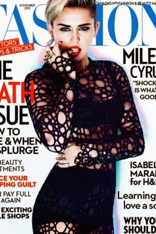
For the main image on the front cover I have based it on a fashion magazine but have decided to use the pose for my magazine for the rock/ pop vibe I want to give off from the model.
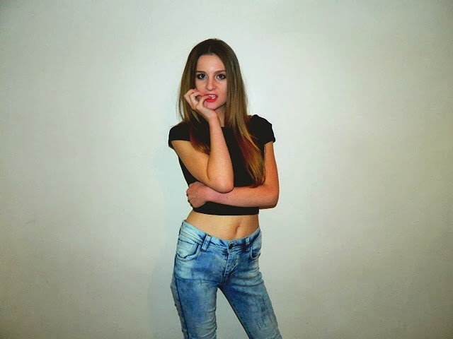 From this I have taken the pose and decided to recreate it. In this image the model is looking directly into the camera which creates an effect of them looking right at the reader and wanting them to buy it. This is relatable to every other magazine because each one has its own way of attracting its audience.
 For the colour scheme I have used the red, black and white to show the rock genre. Because if this, I have based the costume on the colour scheme to help the model stand out from the page. I have used the black shirt and the red lipstick to shadow the red on the background.
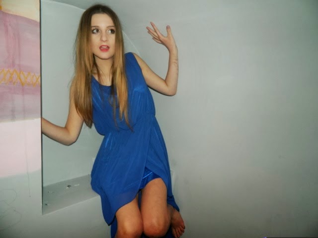
For my contents page, I wanted to carry on the theme by keeping the colour scheme and genre of rock/ pop. I did not have an image to recreate because this was an image taken originally. For the image I used a blue dress that would separate the model from the colour scheme. The model is not facing the camera this time because it is not on the cover. However, her eyes are directed towards the contents, suggesting that it is worth reading.
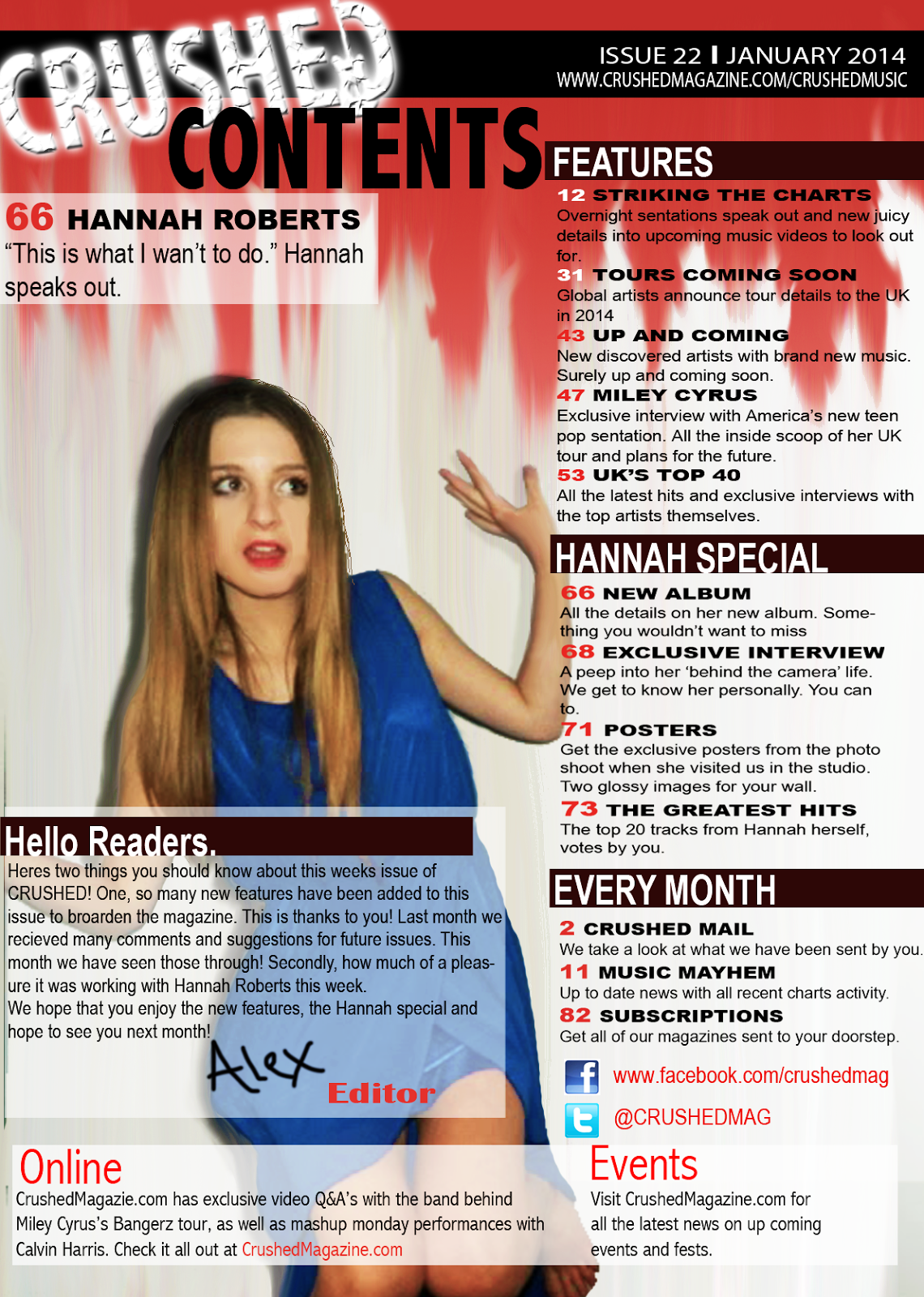
I used the image in my contents page with red running down. This contrasts the colour scheme and for the main image to stand out. It also suggests the genre of rock/ pop by making it look edgy.
With my double page spread I also used an original image and edited it to fit the genre and theme of the page. I did this by taking other shots of the dress used and cropping them and blending them to create the effect of the dress floating across the page.
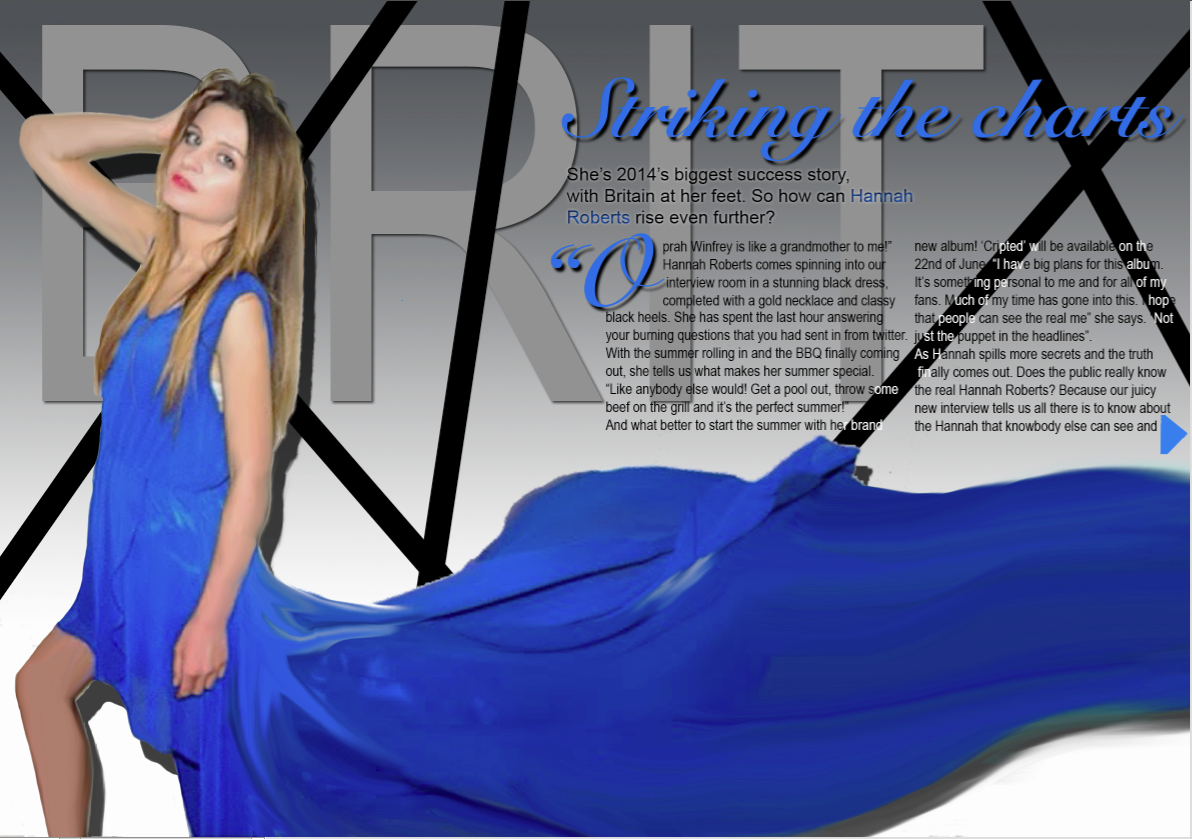 I first composed my double page spread with a grey theme. I did this to create a different background for the model.
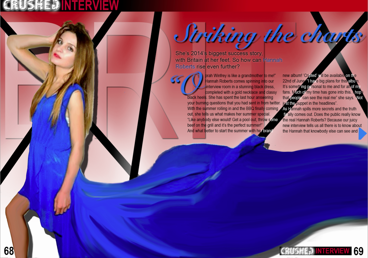 However I them realised that it wasn't constant with my colour scheme of black, red and white. I then changed the colour scheme to show that it is apart of the magazine.
I have ensured that my media product has included as many conventions from a real media product as I have listed. Due to previous research of the magazine industry, I have given my magazine the conventions of magazines that are frequent with every issue. However, I have also addressed conventions that may only be familiar in singular issues or differentiate from other magazine issues. For example, in one of my presentations, I have shown the conventions of the music magazine 'Q'. Q had included many typical music magazine conventions but also has it's perks of showing originality.

For my magazine, I wanted to incorporate originality by using Q as a style model. From the magazines I have analysed, my magazine was going to be based with certain aspects that have made the magazine stand out more than others. To do this, I had included the idea of giving the magazine a music feel. Usually, most music magazines are only told by the artist. If a well known artist is used as the cover image, the reader will assume it is a music magazine. For my magazine, I had decided to show this in a different way. Instead of having a well known artist, I have used an artist that is non-existent and upcoming as stated in the double page spread. I have shown that it is a music magazine by making the actual conventions include an understanding of how it is a music magazine. The title 'CRUSHED' has been shown with an image of a guitar that has been put in the title.

For the main image on the front cover I have based it on a fashion magazine but have decided to use the pose for my magazine for the rock/ pop vibe I want to give off from the model.
 From this I have taken the pose and decided to recreate it. In this image the model is looking directly into the camera which creates an effect of them looking right at the reader and wanting them to buy it. This is relatable to every other magazine because each one has its own way of attracting its audience.
  For the colour scheme I have used the red, black and white to show the rock genre. Because if this, I have based the costume on the colour scheme to help the model stand out from the page. I have used the black shirt and the red lipstick to shadow the red on the background.
For my contents page, I wanted to carry on the theme by keeping the colour scheme and genre of rock/ pop. I did not have an image to recreate because this was an image taken originally. For the image I used a blue dress that would separate the model from the colour scheme. The model is not facing the camera this time because it is not on the cover. However, her eyes are directed towards the contents, suggesting that it is worth reading.

I used the image in my contents page with red running down. This contrasts the colour scheme and for the main image to stand out. It also suggests the genre of rock/ pop by making it look edgy.
With my double page spread I also used an original image and edited it to fit the genre and theme of the page. I did this by taking other shots of the dress used and cropping them and blending them to create the effect of the dress floating across the page.
 I first composed my double page spread with a grey theme. I did this to create a different background for the model.
 However I them realised that it wasn't constant with my colour scheme of black, red and white. I then changed the colour scheme to show that it is apart of the magazine.
Tuesday, 6 May 2014
Audience research
For my audience research, I stuck to my main target audience of being teens and mainly female. I asked 20 people a few questions on my magazine to get feedback and suggestions for improvements. As my magazine is mainly for female, I asked 15 girls and 5 boys to answer the questions so I can get answers from both but extra answers from my target audience.
The main questions I asked were;
1. What target audience do you think the magazine has?
2. What genre do you think the magazine is and how?
3.What improvements could be made?
For the first question I was given a mixed response. 25% of the 20 had said that the magazine would attract a young adult target audience. However, 50% had said that it attract a teenage audience. The twenty five percent included 5 people, two of which where boys. The other 25% said that they just though it was a younger audience.

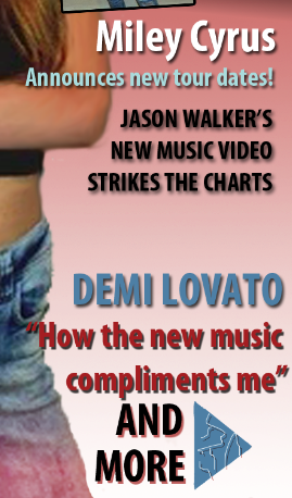 For the second question, the response was all the same which was that the genre of the magazine was music. I was told how they could tell and 10% said that it was because of the guitar that is included within the mathead. The other 90% said that it was the artists used for the subheadings as they themselves attract a younger audience and are related to music.
The third question was mainly minor things that I have since improved on. The main one was the text size on the double page spread, in which it was too big. Since then I have made the text smaller and added the rest of the text onto the page as it could fit then.
The main questions I asked were;
1. What target audience do you think the magazine has?
2. What genre do you think the magazine is and how?
3.What improvements could be made?
For the first question I was given a mixed response. 25% of the 20 had said that the magazine would attract a young adult target audience. However, 50% had said that it attract a teenage audience. The twenty five percent included 5 people, two of which where boys. The other 25% said that they just though it was a younger audience.

 For the second question, the response was all the same which was that the genre of the magazine was music. I was told how they could tell and 10% said that it was because of the guitar that is included within the mathead. The other 90% said that it was the artists used for the subheadings as they themselves attract a younger audience and are related to music.
The third question was mainly minor things that I have since improved on. The main one was the text size on the double page spread, in which it was too big. Since then I have made the text smaller and added the rest of the text onto the page as it could fit then.
Subscribe to:
Comments (Atom)


