Wednesday, 27 November 2013

Description of images for my magazine front cover


For my main image, I have planned to stick to my genre of pop/rock and use conventions that suggest to that. I will be taking my pictures on a plain white wall and include lighting at different angles. The angle of the camera will be taken face on because I have found with my own research that music magazine cover images usually have an image of the artist looking head on. 

For my location I have chosen to use a white painted wall at home just so I can get a plain and simple background for my main image. For the person who will be on my front cover, my cousin has agreed to be in the photographs as she has the costumes and makeup I am looking for in my front cover. 


For props I will be using my own guitar which will be held by my cousin the photographs. For makeup and costume I have chosen to keep the rock and pop look by using clothing items such as ripped jeans and rock shirts. The image will be taken as a medium long shot but I will also be taking other photographs for the double paged spread which will be full length shots of the whole body. As it is a double paged spread I will have the photograph taken long ways so I can edit it across the two pages.


Tuesday, 26 November 2013

Main cover image templates

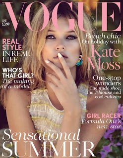
Even though some of these magazines are not related to music, I plan to use the main cover images of these magazine as a template for my own for when I come to take them. 


Plan for images

For my photo shoot to use as my main cover image, I am planning on using props and costume to connote my music genre of pop\rock. As my style model is 'Q' magazine, I have chosen to stick to their ideas for a main cover image. The background on my image will be plain white because it is what most music magazines have used. For props I will use a guitar to relate to the rock and pop genre to make sure that it is attracting the correct audience.

As for the costume I will be using casual and edgy clothing. For example I will go with ripped jeans and a loose rocky shirt. I plan to have a female main image. Makeup will be used to show the rocky vibe by having thick black eye liner to emphasis the rocky image.

The colour scheme for the whole magazine will depend on the main image. For example I will choose a red and black colour for rock but will also include other colours to make subheadings pop out and to show the 'Pop' genre.

For a casual look and to blend the image I plan to use a filter on the actual image to make it seem lighter . This will make the image stand out from the rest of the page because it will be blended into the colour scheme but be lighter than the rest of the page.

Wednesday, 20 November 2013

Mise en scene

For a basic outline of my magazine photo shoot, I have tried to stick within the pop and rock music magazine genre for the image. For the lighting on my image, I want it to be a basic lighting but more directed onto the face. This is so the model can stand out from the page.

 For the costume of the photo shoot, I want the image to be simple but have the conventions of a pop and rock music magazine so I have decided to do a casual clothing but have a rocky vibe to it so it can relate to the genre. For the props in my cover, to keep the genre flowing throughout, I would like the person to be holding a guitar. This makes the person appear like they are a casual normal person but also have the rock side to them. For the background of my image I would like to have a plain white background which could be edited in with photoshop.

 For the photo shoot, I will start the image by having it behind a plane blank wall and have it whitened when it comes to editing. The colour of the image will be darkened slightly to keep the vibe of the pop and rock magazine genre by keeping it bold and easy to see against a white background. For my camera angle I would like the image to be a full body shot so that the whole magazine cover is filled and that the body expressions can be seen.

Style Model

For my own magazine, my style model will be based on Q magazine. I have chosen my style model to be Q magazine because it relates to my chosen target audience for my magazine. It is a mature music magazine and can relate to young adults and older teens. The magazine's layout is how I would like to present my own because it is clear with the subheadings and the title stands out. Even though it has all the conventions of a general music magazine, it still does it's job of engaging the reader/ buyer from the shelf.
For my cover photo, I would like to base it on Q magazine because they generally have a clear single image in the centre so it can pop out from the page and engage fans of the artist. It is a simple picture used but has a big effect on the people wanting to buy it. The music genre I have chosen for my own magazine is also based on Q magazine. Because my magazine is having a music genre of pop and rock, Q magazine is based on that music genre. As the magazine has a big following of people, it is proved that a pop and rock magazine does well selling and is very popular. My magazine will be pop and rock because it is the the biggest followed music genre that most people will be able to relate to. All of the subheadings are based on the pop and rock music genre so that even the inside of the magazine is based on that genre.

Wednesday, 13 November 2013

Kerrang! magazine masthead

With most of the magazines of Kerrang! the main image is usually covering the masthead. This is because the magazine is well known and people wont need to see all of the masthead to know what magazine it is. The magazine may have a huge following so that people wouldn't have to see it.

Q magazine relations

Q magazine's front covers are generally the same. For example the layout is always the same. The logo is always located in the top left of the magazine cover. This could be so the reader/ buyer knows that it is Q magazine so that their followers ad fans can find the magazine. They use a wide range of main images, the artists are usually from completely different music genres so it can broadcast across many people so that they can purchase it.

Q magazine

For the Q magazine, it has similar conventions (if not, the same conventions) to relate to the music genre and to show the reader/ buyer what kind of magazine it is. It is done by the way it is displayed (cover image being the main) and showing what is inside the magazine.
This is done by giving strap lines and headings as to what is inside the magazine.

Kerrang! magazine

With the magazines I had chosen to compare conventions, I found that many of the conventions where either similar or the same. From this I have found that many of the music magazines are alike in the conventions used. This could be to tell the reader/ buyer that it is a music magazine so that they can tell them apart from a different genre magazine.
In this image, the conventions are similar to any music magazine because it relates to the music genre. Paramore is also used as the main cover image to tell the reader/ buyer that what is inside the magazine relates to music and that the magazine will be based on music.

Monday, 11 November 2013

Typical reader for my magazine

For my typical music magazine reader, the age of the reader will be a young adult aged 19- 25. The hobbies of the reader will mainly be music related so that they can relate to the magazine from their personal experience. For their favourite movies, it will mainly be based on mature movies. For their music taste, pop and rock will be the main music genre but mainly would be any general type of music that can relate to the magazine so that they can relate to the music that will be in the magazine. For likes and dislikes, their likes would be mainly music and the background story of the artists. For dislikes, the reader may not like other music genres so this will appeal them to the magazine.

Music magazine findings

After my findings and comparing the conventions of two different genre music magazines, I found that both where similar in the way a music magazine would appear to its audience. Due to my findings, I have decided on how to present my own music magazine. For my target audience I have decided to go with a young adult music magazine because most music in the charts is used for younger generations. This would relate to the young adults that watch the chart shows so it can appeal to not only young adults, but a wider audience (teens). For the gender of my music magazine, I have decided to go with both males and females because the magazine will be based on pop/ rock music which can appeal to both genders. I have picked the music genre of pop and rock to appeal to both genders and any older generations that like the music as well as teens. Both single artists and bands will be featured inside the magazine so it can engage a buyer that like both or one. For my front cover I plan to use a single artist but have subheadings that include bands. An example of a magazine that I would like to base mine on would be similar to the Billboard and Q magazine. This is because it relates to the young adult audience.