Alexandra Wylde AS Media
Friday, 9 May 2014
Question 7
7. Looking back at your preliminary task, what do you feel you have learnt in the progression from it to the full product?
 From the start of creating my music magazine, my knowledge of using photoshop has increased considerably. For example I now know how to use different features and filters that I hadn't known was there before. In addition, I have increased my knowledge on how to blur the image into the background to make it look part of the background, making the line of the image not looking as sharp. An example of this would be my magazine contents page. For this I had to blur the image outwards to make a background for the image. This made the line of the cut out image look less sharp.
I feel like I have used more of a variety of techniques than my preliminary task. For example I have included quotes from inside the magazine, competitions and freebies (two free posters) to appeal to the audience where as my preliminary task lacked this. The images taken from the preliminary task I feel didn't give as strong as impact as the main task. This is due to the image quality. Sending the images over, it seemed to distort the image and make it look more pixelised. For my main task I fixed this by using the blur tool to smoothen the image.
Overall, my understanding of softwares has improved greatly throughout this project because at the start i'd barely used software such as photoshop in the years. Also I feel I have a greater understanding and knowledge on how to produce a music magazine and what sort of work goes into making one.
Thursday, 8 May 2014
Question 6
6. What have you learnt about technologies from the process of
constructing this product?

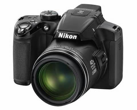
With the construction of my product, I have used many technologies to produce it. The first of all would be a Nikon camera. This was used to construct a photo shoot for images to use on my product. From the images, I used an app to create a filter that could benefit the photo to make is darker and more glossy.

After the filter was used on my images, I picked out the best ones that would attract the target audience. With the chosen image I then used photoshop. From this I had also added extra filters to suit the genre by adding a dark undertone for the rock vibe the image needed to give off. A vibrance effect was also used to enhance the colours of the clothing but keeping the dark under layer. This made the image appear bright but standing out from the page that was a vibrant red.

I then continued to use the magic wand tool that cut the image out automatically. Due to the sharp edges I then used the pencil tool to draw on the edges to blend them into the background. From this, the image has began to show pixelation. To fix this, I used the blur tool to blend out the skin to make is look smoother. From this, the image deformed where I had to use the paint tool to draw on other parts to reclaim the image.
This was also used with the contents main image and the double page spread. This is due to the same filters used to match the rest of the magazine product. The text was used by photoshop as well as it was only a simple text that I needed. The masthead of the magazine was also used in photoshop where I had used the pencil tool and a filter to create a glow, patterned effect and the cracks in the image.
constructing this product?

With the construction of my product, I have used many technologies to produce it. The first of all would be a Nikon camera. This was used to construct a photo shoot for images to use on my product. From the images, I used an app to create a filter that could benefit the photo to make is darker and more glossy.

After the filter was used on my images, I picked out the best ones that would attract the target audience. With the chosen image I then used photoshop. From this I had also added extra filters to suit the genre by adding a dark undertone for the rock vibe the image needed to give off. A vibrance effect was also used to enhance the colours of the clothing but keeping the dark under layer. This made the image appear bright but standing out from the page that was a vibrant red.

I then continued to use the magic wand tool that cut the image out automatically. Due to the sharp edges I then used the pencil tool to draw on the edges to blend them into the background. From this, the image has began to show pixelation. To fix this, I used the blur tool to blend out the skin to make is look smoother. From this, the image deformed where I had to use the paint tool to draw on other parts to reclaim the image.
This was also used with the contents main image and the double page spread. This is due to the same filters used to match the rest of the magazine product. The text was used by photoshop as well as it was only a simple text that I needed. The masthead of the magazine was also used in photoshop where I had used the pencil tool and a filter to create a glow, patterned effect and the cracks in the image.
Question 5
5. How did you attract/address your audience?
With my media product, I have addressed the target audience of teenagers and young adults by using certain conventions and imagery to appeal to them. For example, on the cover of my magazine I have used conventions that attract to the target audience. The first would be the main image. The image itself is an image of a teenager that is suggested to be a big star. I used this to attract to the target audience because it is relatable and someone to look up to. A big star would also be of someone that they follow.
Another conventions would be the context on the page. The subheadings contain other music related people that could attract younger people form their image or name. They appeal to the target audience in their own way which would benefit on the front of a teenage music genre magazine.
Thirdly, another would be the colour scheme used. This is relatable to the target audience of teenagers and young adults because of the boldness of the colours. My colour theme is red, white and black which are a trend of colours that are bold ad outgoing- relatable to the target audience as it is attracting the people with the trends and boldness of music- teenagers and young adults.
Overall, my magazine attracted it's audience by the context and the presentational conventions that would attract them. This if from imagery, colour and context.
Subscribe to:
Comments (Atom)


